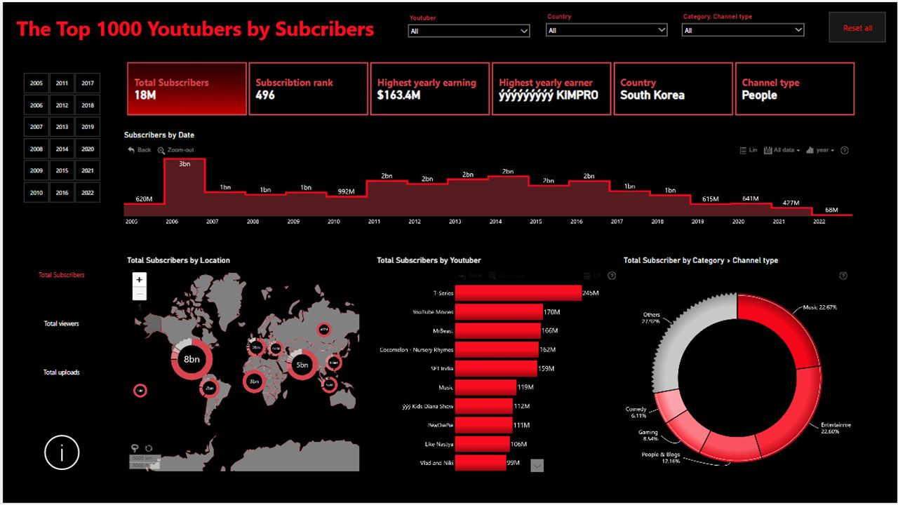
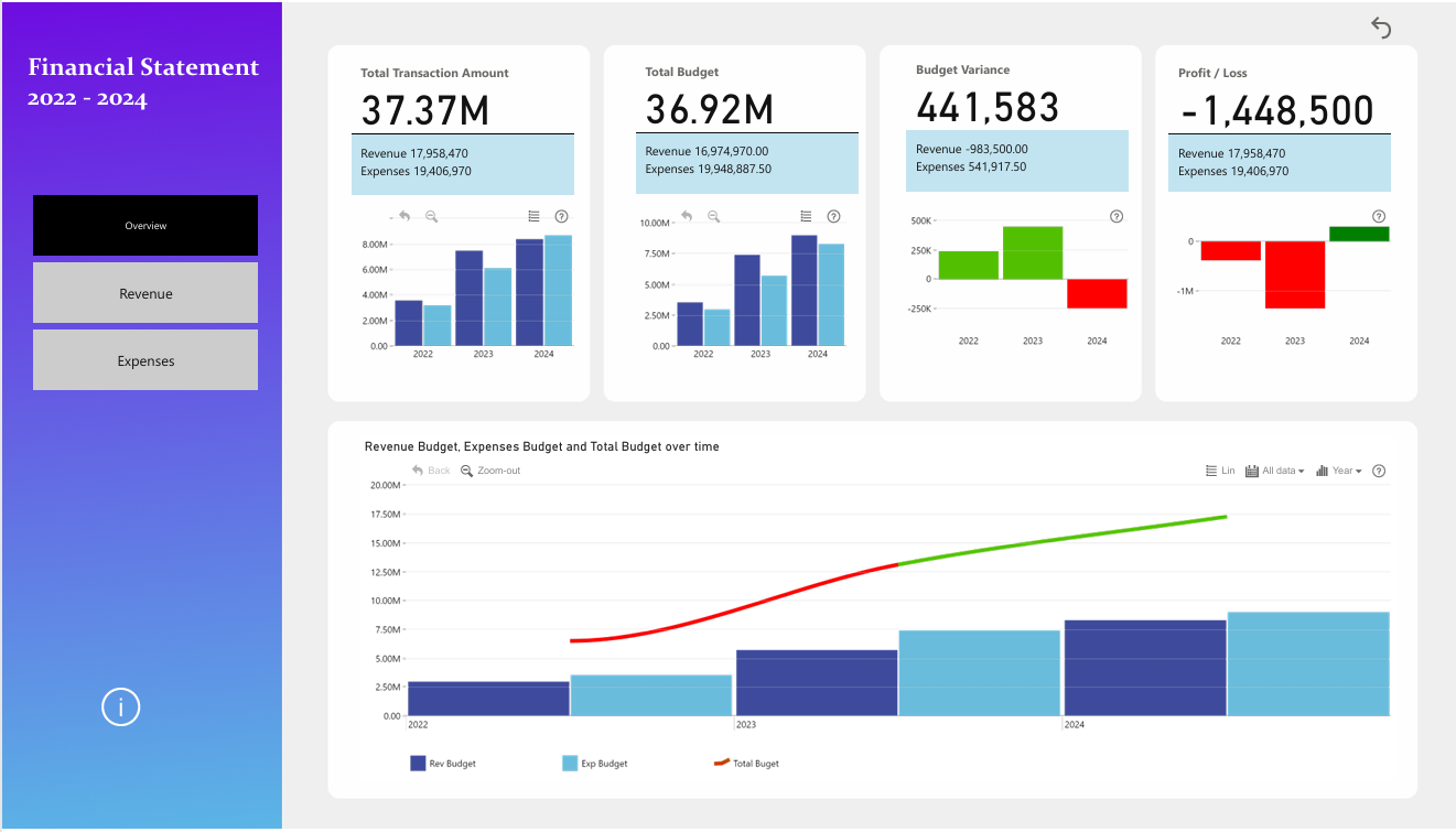
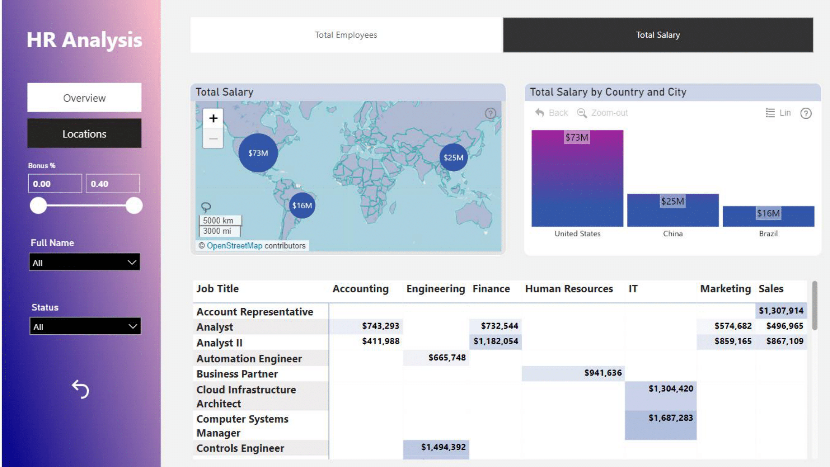
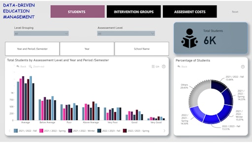
Plotly Dash
mostly Charming Data & Figure Friday Projects
Currently only the first 5 projects have a live app link — the rest are viewable as images.
View App
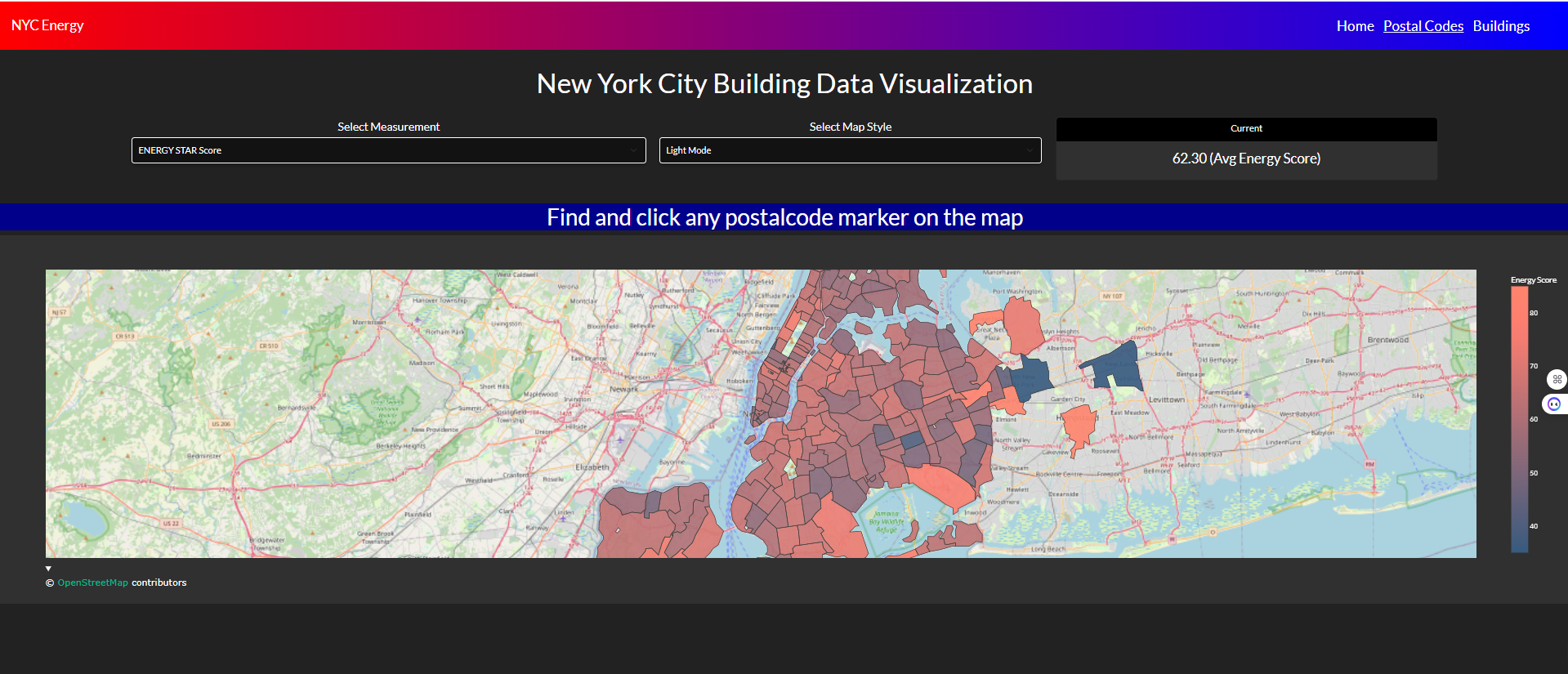
NYC Energy analysis with map
Interactive map-based analysis of New York City's energy consumption patterns. The dashboard visualizes energy usage across different boroughs and building types. Built with Plotly Dash featuring geospatial data layers.
View App
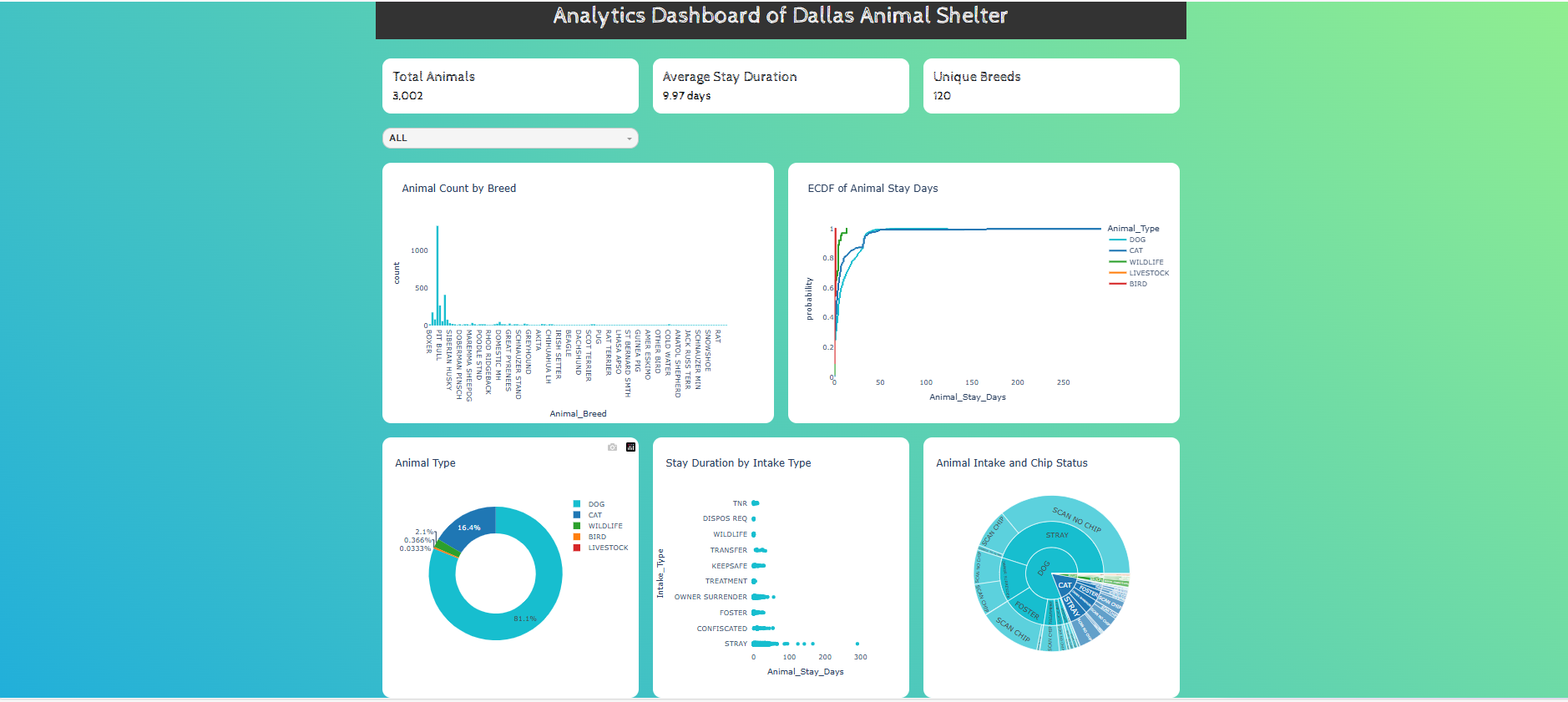
Dallas Animals Shelter Analysis
Detailed analysis of Dallas animal shelter intake and outcome data. The project examines adoption rates, animal types, and seasonal trends. Interactive Dash application hosted on PyCafe.
View App
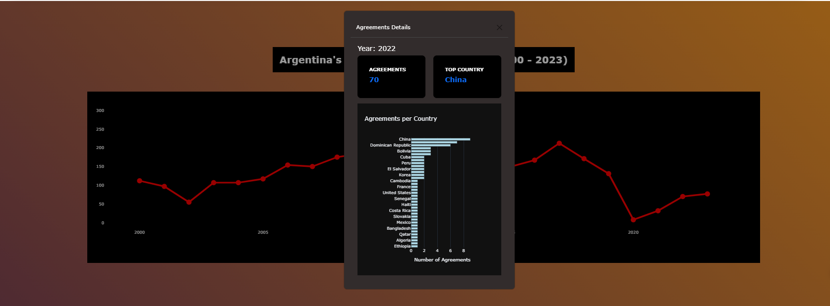
Argentina Billateral Treatments from 2000 -2023
Analysis of Argentina's bilateral agreements between 2000 and 2023. The dashboard visualizes international partnerships and treaty types across countries. Built as a Plotly Dash web application.
View App
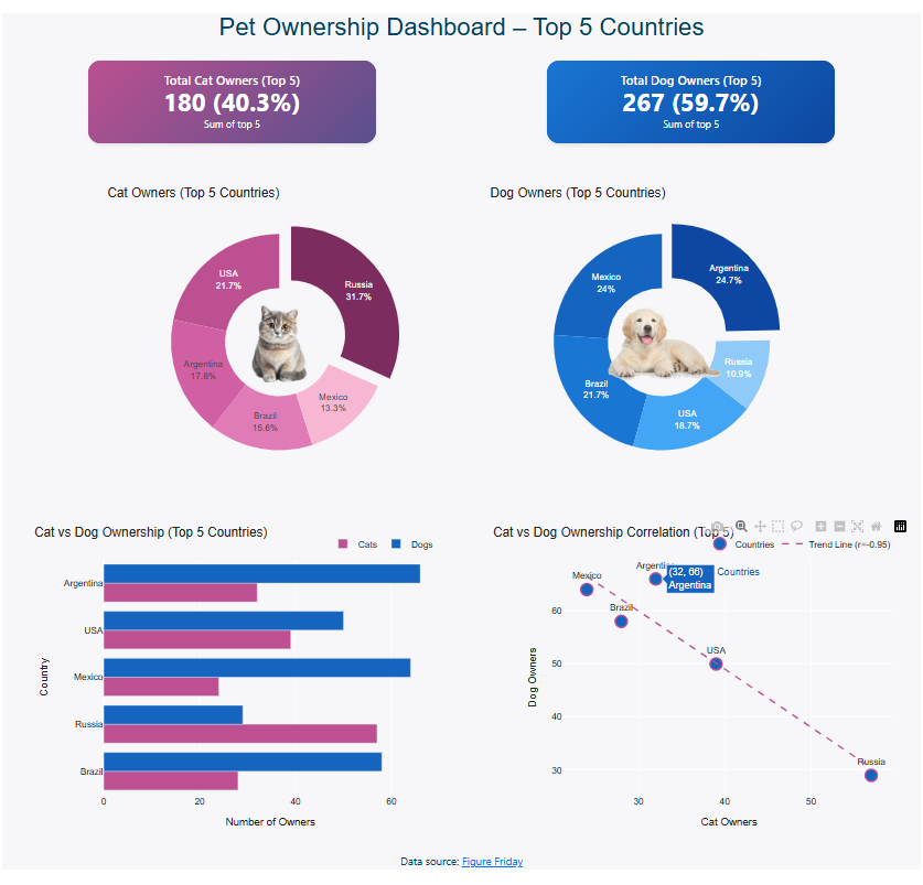
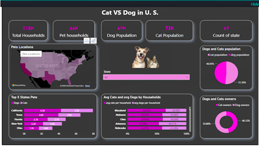
Cats and dogs analysis
Pet ownership data analysis comparing the top 5 countries worldwide. The project explores cat and dog ownership trends and patterns. Interactive Dash dashboard hosted on PyCafe.
View App
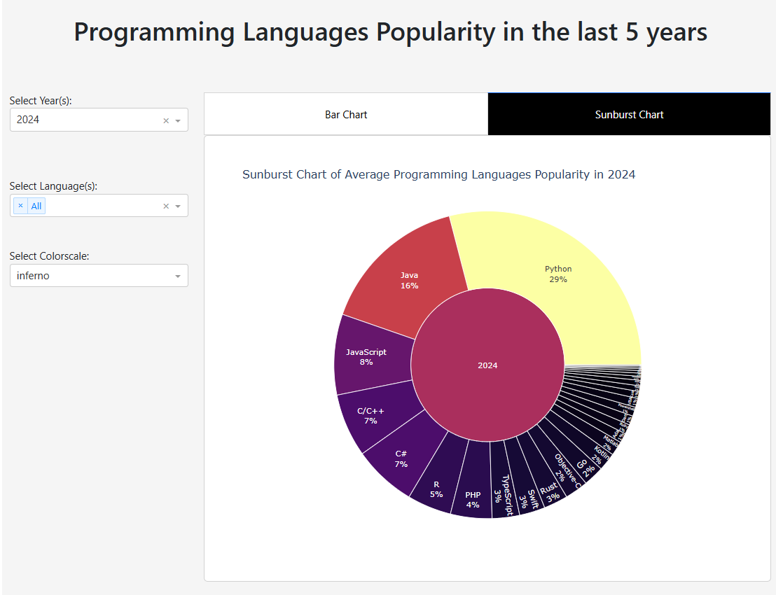
Programming Languages analysis
Analysis of programming language popularity and trends over time. The dashboard tracks the rise and fall of various languages. Built as a Plotly Dash visualization application.
View Image
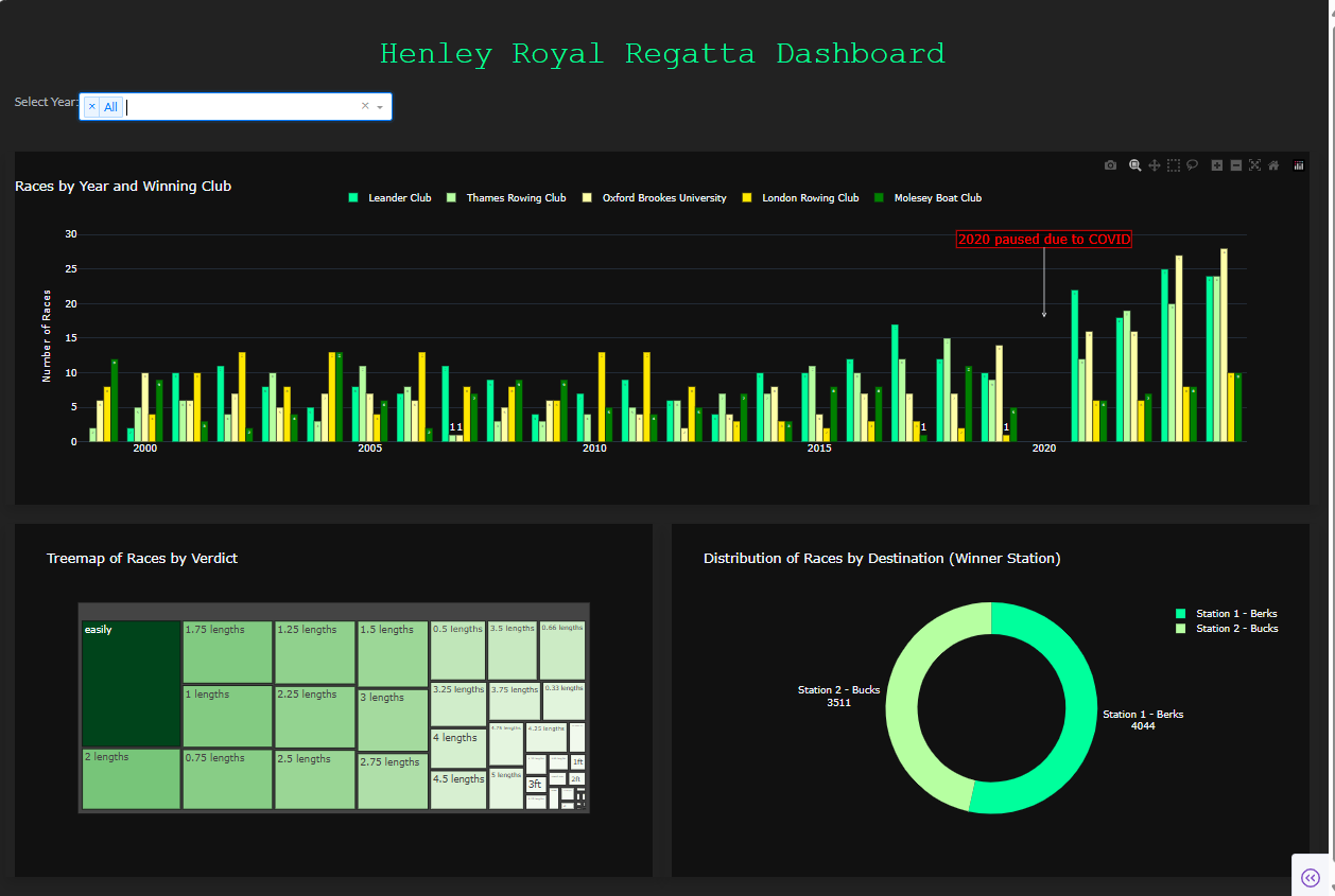
Henley Royal
Data analysis of the Henley Royal Regatta rowing competition. The project visualizes race results, team statistics, and historical records. Built as an interactive Dash application.
View Image
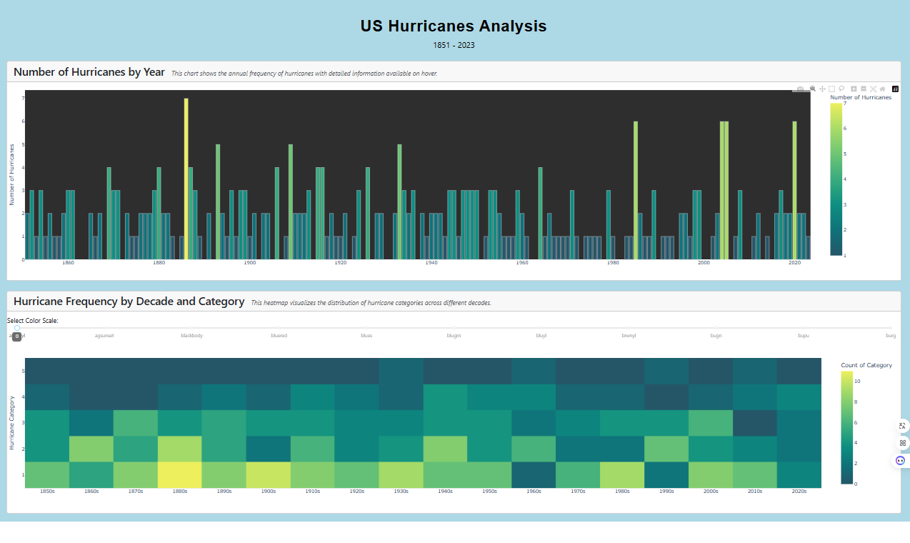
US Hurricans
Analysis of hurricanes affecting the United States. The dashboard maps storm paths, intensity levels, and damage data. Interactive Plotly Dash visualization application.
View Image
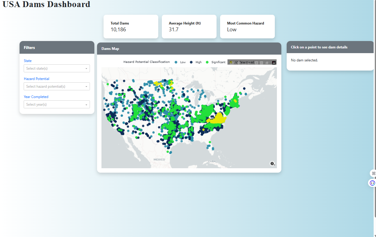
US Dams
Data analysis of dams and reservoirs across the United States. The project visualizes dam locations, types, and structural conditions. Interactive Dash application with map-based display.
View Image
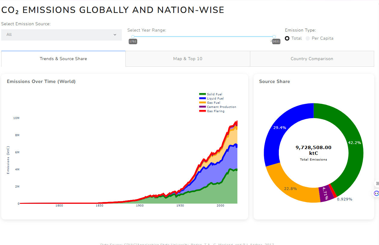
CO2 Emisssions
Global analysis of carbon dioxide emission data by country and region. The dashboard presents emission trends and historical comparisons. Interactive Plotly Dash visualization.
View Image
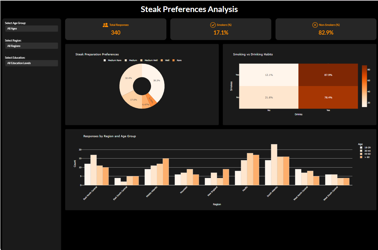
Steak Preferences
Survey-based analysis of steak consumption and cooking preferences. The project visualizes doneness levels and dining habits across demographics. Interactive Dash dashboard.
View Image
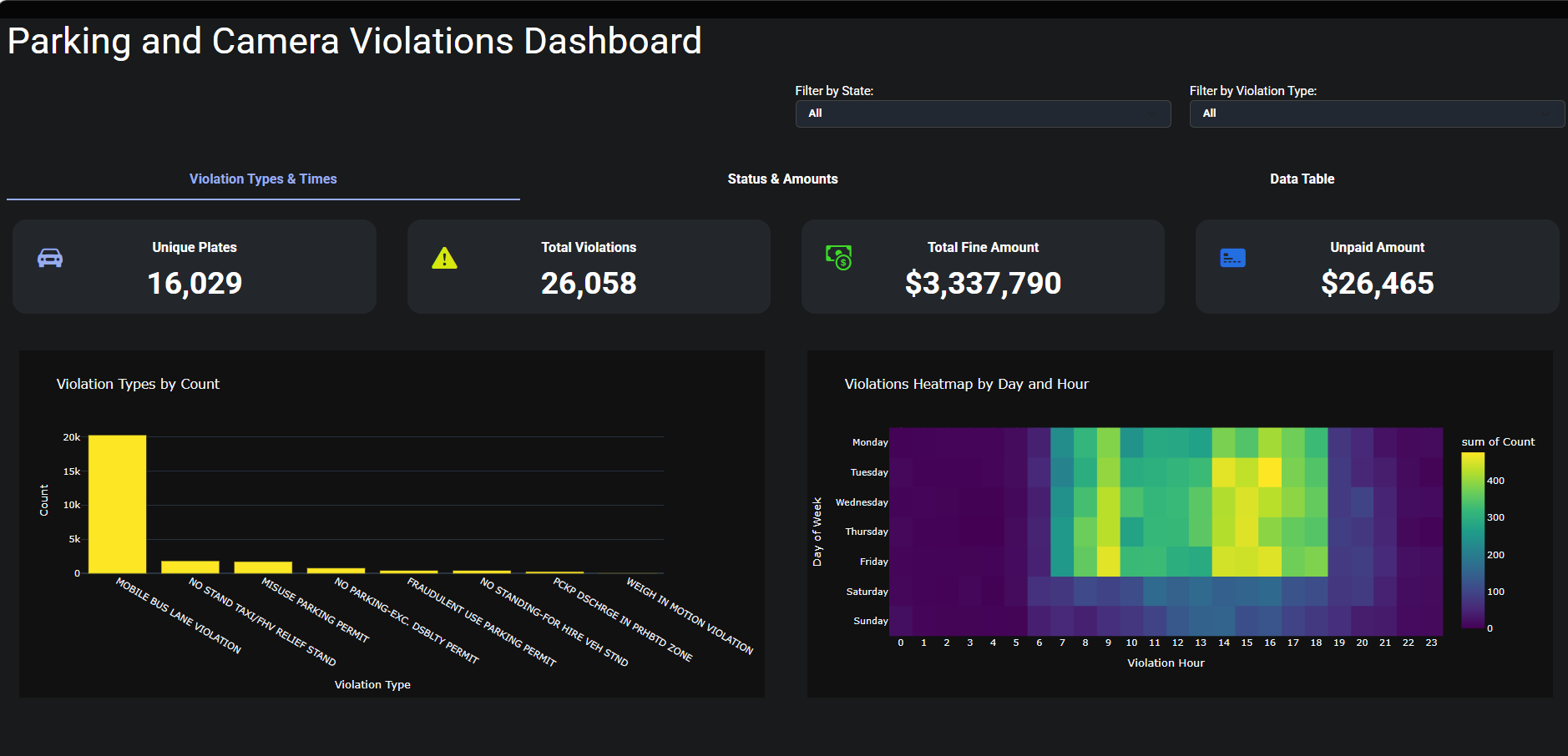
Parking and Camera Violations
Analysis of parking and traffic camera violation data. The dashboard presents fine types, locations, and temporal trends. Interactive Dash application.
View Image
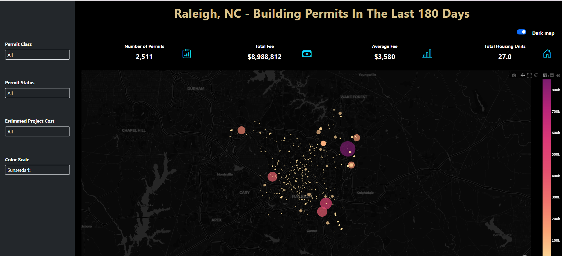
Building Permits
Analysis of building permit issuance and types over time. The project visualizes permit trends and geographic distribution. Interactive Dash dashboard.
View Image
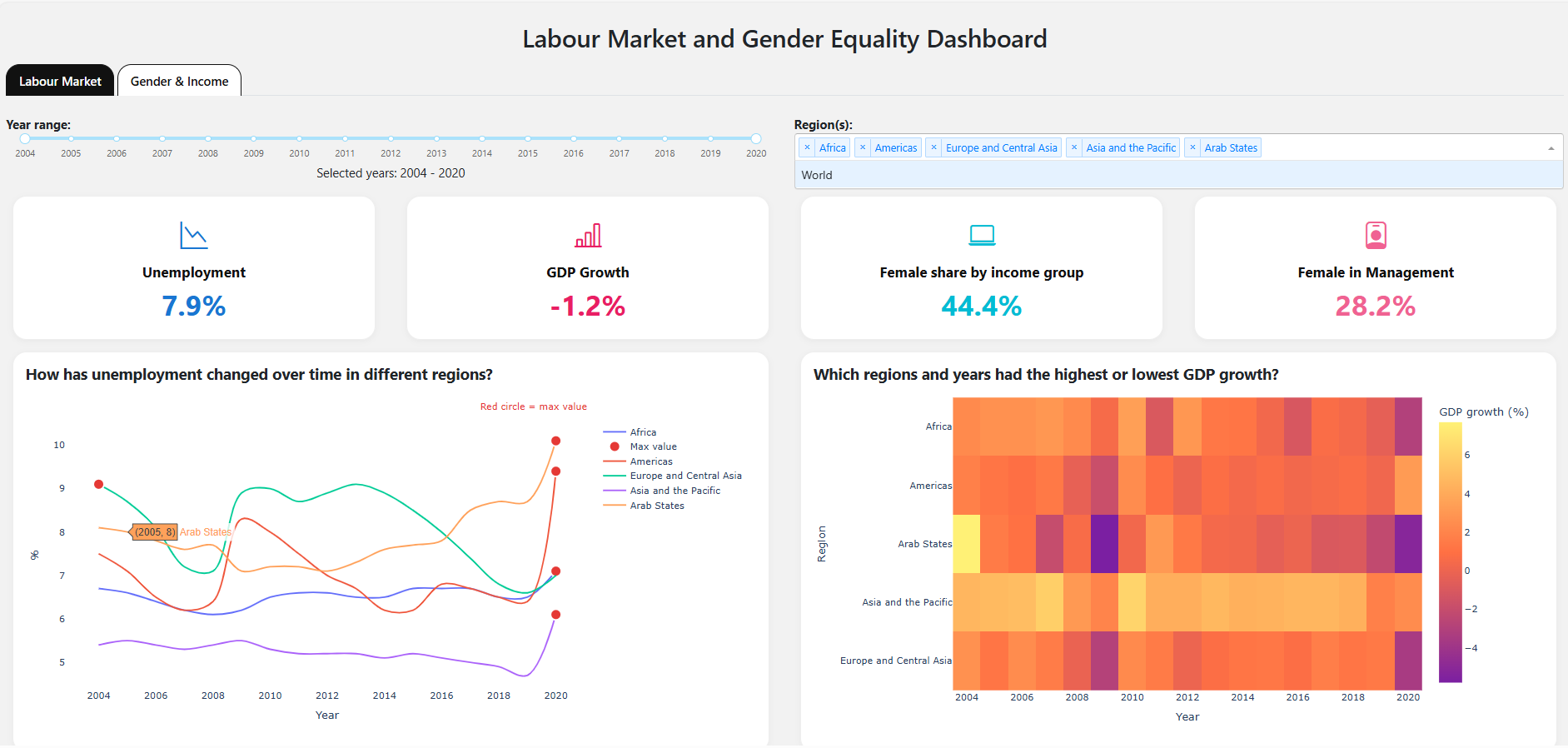
Labour market
Comprehensive analysis of labour market conditions and employment data. The dashboard presents workforce trends and job market indicators. Built with Plotly Dash visualizations.
View Image
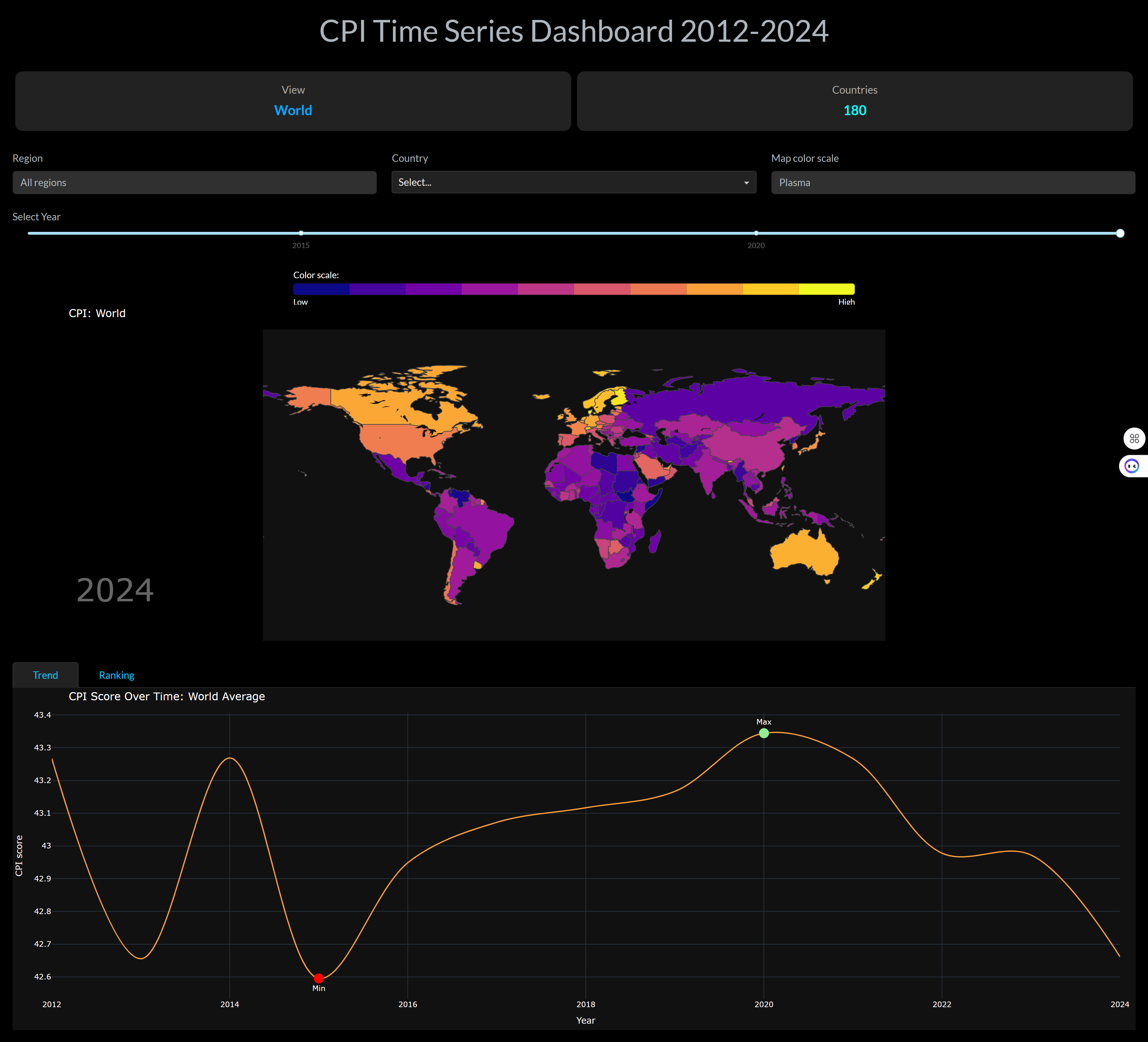
Corruptions
Visualization of the global corruption perception index data. The dashboard analyzes corruption levels across countries and their changes over time. Dash application hosted on Render.
View Image
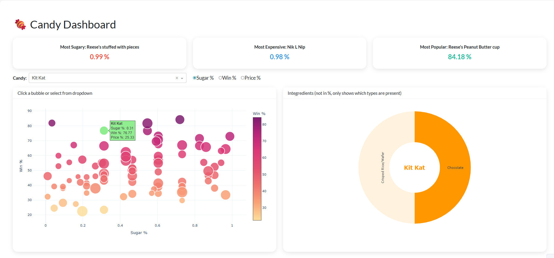
Candy analysis
Analysis of candy properties and consumer popularity rankings. The dashboard visualizes ingredients, sugar content, and preferences. Plotly Dash application.
View Image
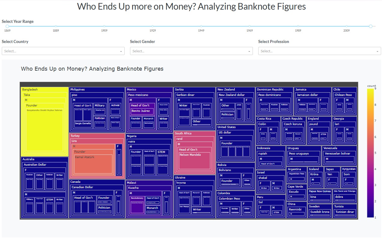
Banknote Figures
Analysis of figures and portraits depicted on world banknotes. The project visualizes the people represented on currency across nations. Interactive Dash dashboard.
View Image
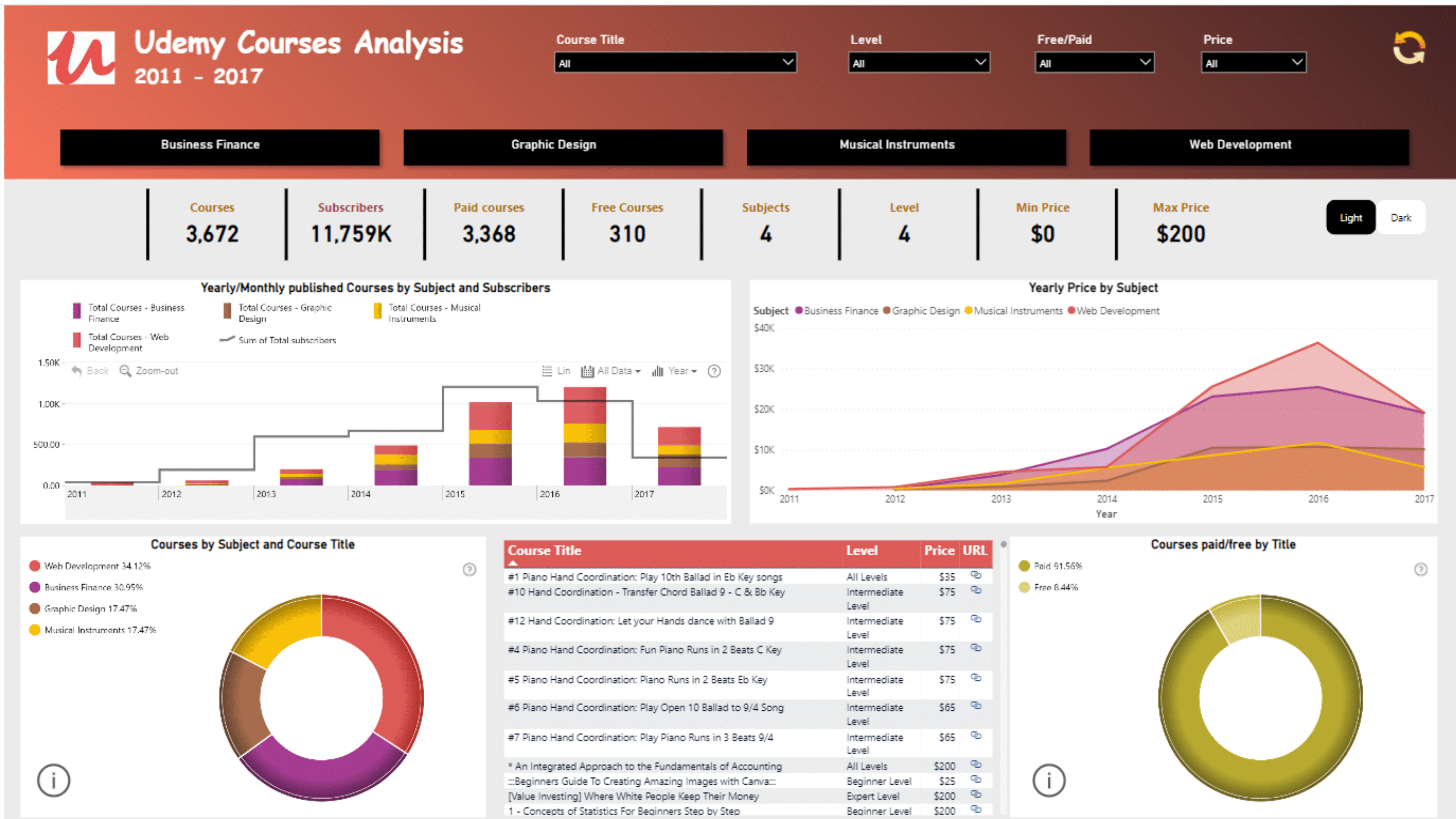
Programming Languages Popularity
Comprehensive analysis of programming language popularity trends over the years. The dashboard tracks shifting developer preferences and adoption rates. Interactive Dash application with updated data.
View Image
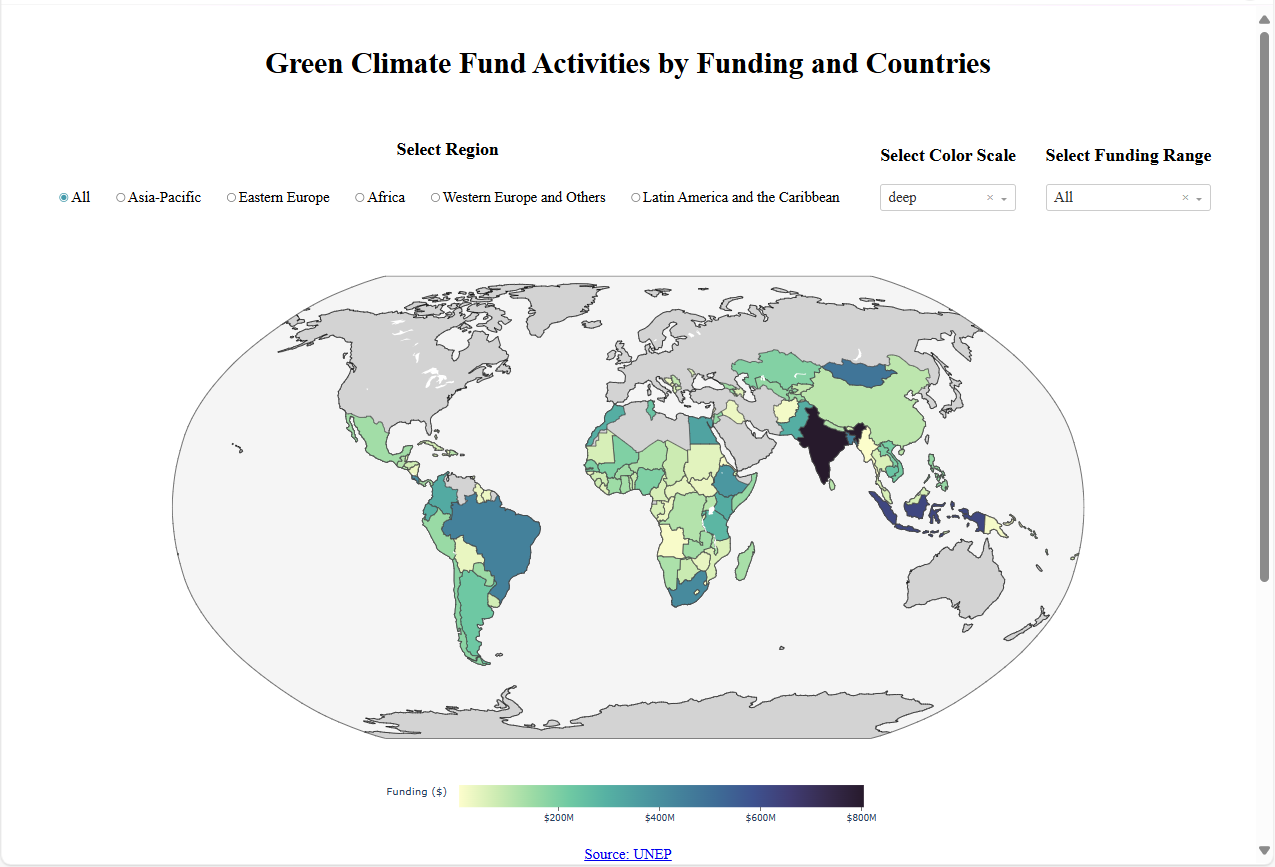
Green Climate Fund Activities by Funding and Countries
Analysis of Green Climate Fund activities by funding amounts and recipient countries. The dashboard presents the distribution of climate protection projects globally. Created for the Figure Friday challenge.
View Image
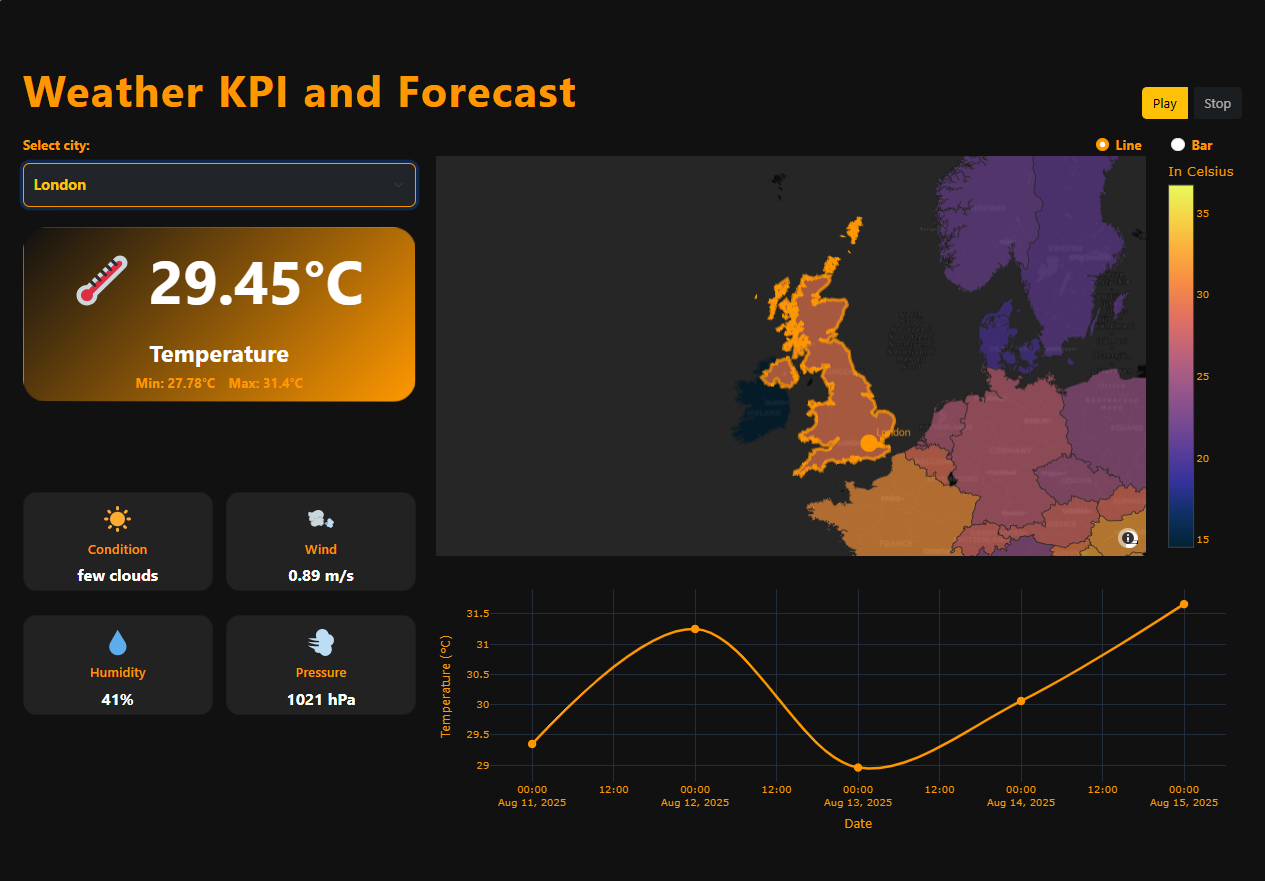
Weather
Real-time weather data display and analysis application. The dashboard visualizes temperature, precipitation, and wind data. Dash application hosted on Render.
View Image
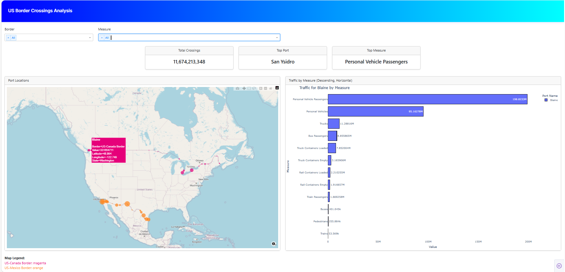
US Border Crossings
Traffic analysis of United States border crossing points. The dashboard visualizes crossing volumes, types, and trends over time. Plotly Dash application.
View Image
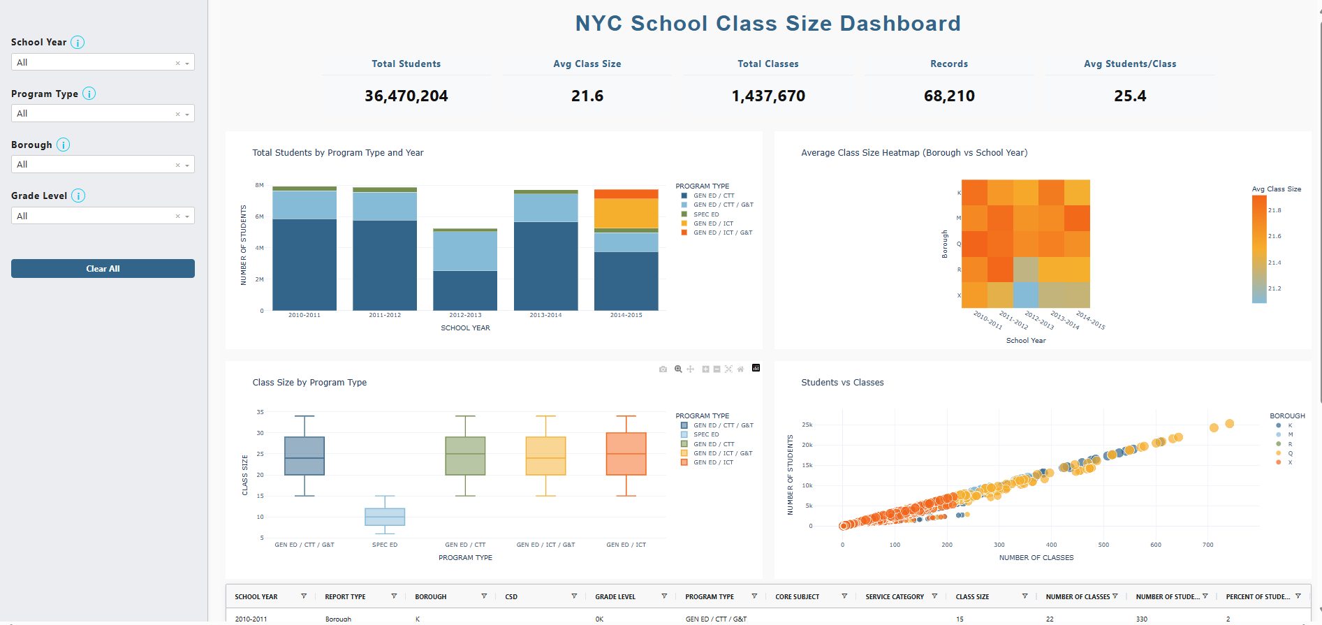
Class sizes
Analysis of school class sizes and their distribution patterns. The dashboard presents class size data across different schools and districts. Plotly Dash application.
View Image
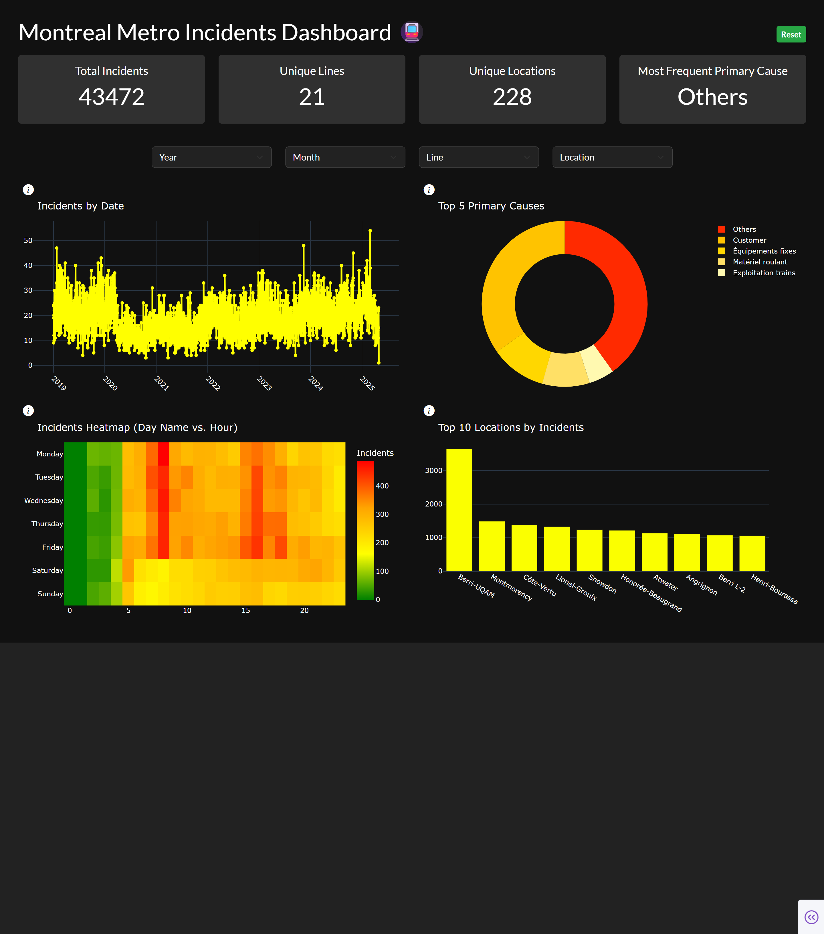
Montreal Metro incidents
Analysis of incidents on the Montreal metro network. The dashboard visualizes delays, breakdowns, and service disruptions. Dash application hosted on Render.
View Image
.png)
Survey
Visualization and analysis of survey response data. The dashboard interactively presents answer distributions and patterns. Built with Plotly Dash.
View Image
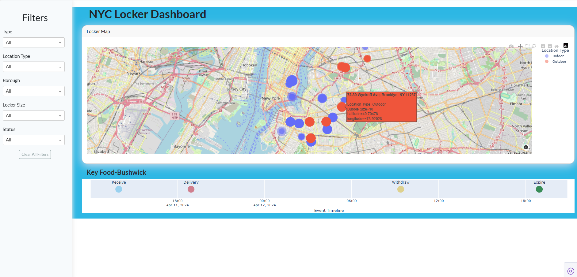
NYC Lockers
Analysis of package locker locations across New York City. The dashboard maps locker services and availability by neighborhood. Dash application hosted on Render.
View Image
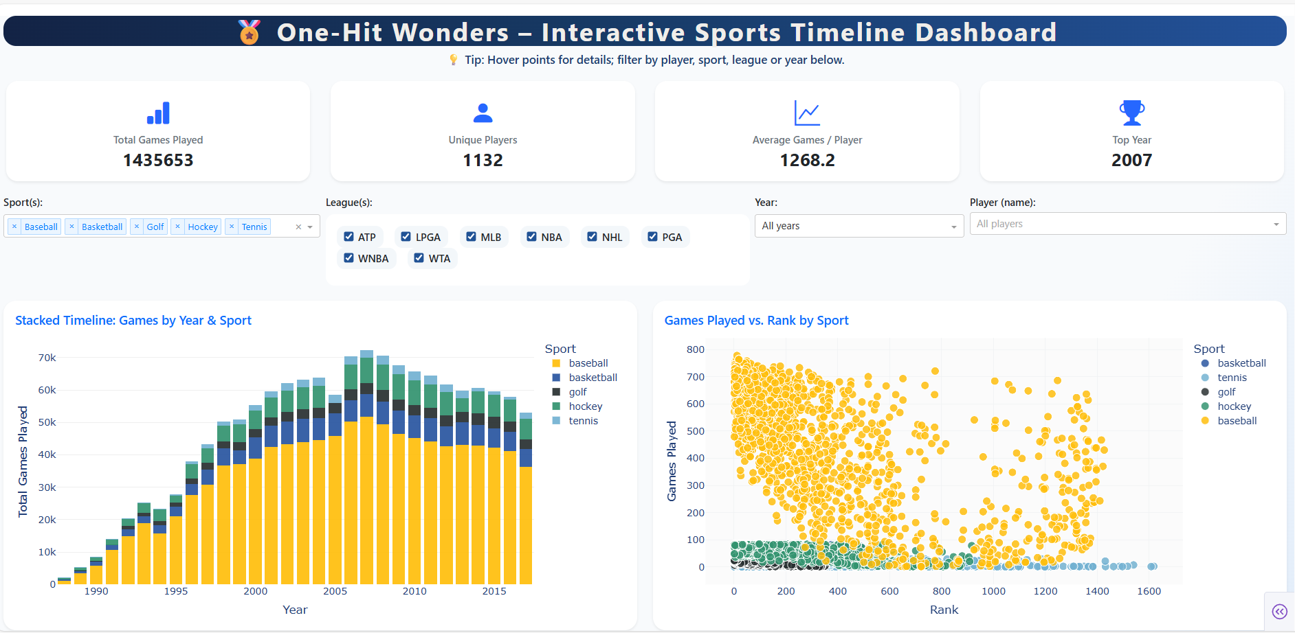
One Hit Wonders
Musical data analysis of one-hit wonder artists and their songs. The dashboard visualizes song popularity and chart performance. Interactive Dash application on PyCafe.
View Image
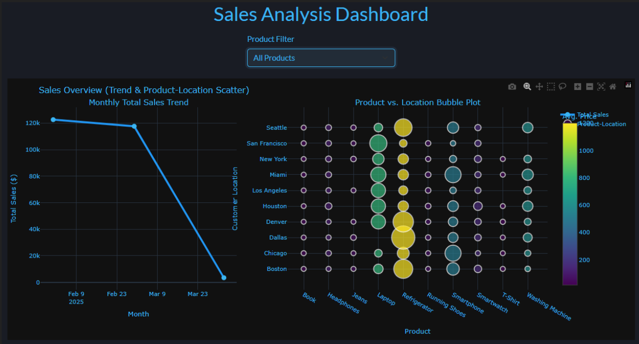
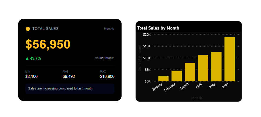
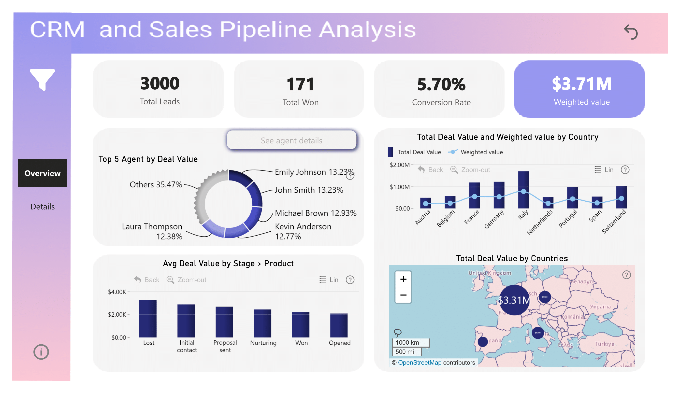
Sales Analysis
Comprehensive analysis and visualization of sales data. The dashboard presents revenue, product performance, and market trends. Built with Plotly Dash.
View Image
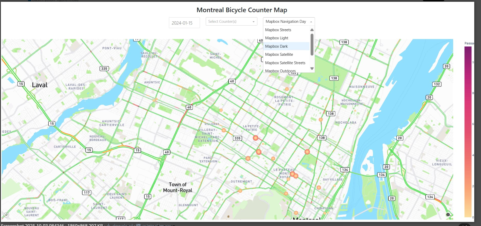
Montreal Bicycle
Analysis of Montreal's cycling infrastructure and traffic data. The dashboard visualizes bike path usage and seasonal patterns. Built with Plotly Dash.
View Image
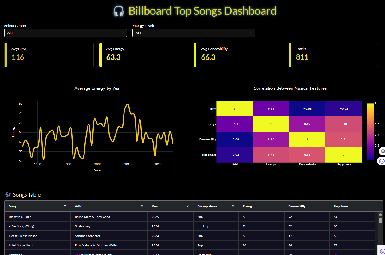
Billboard
Analysis of Billboard music chart data and hit rankings. The dashboard visualizes song performance and charting trends. Built with Plotly Dash.
View Image
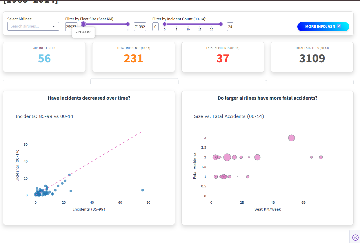
Airline-safety
Comparative analysis of airline safety records and statistics. The dashboard visualizes incident data and accident rates by carrier. Built with Plotly Dash.
View Image
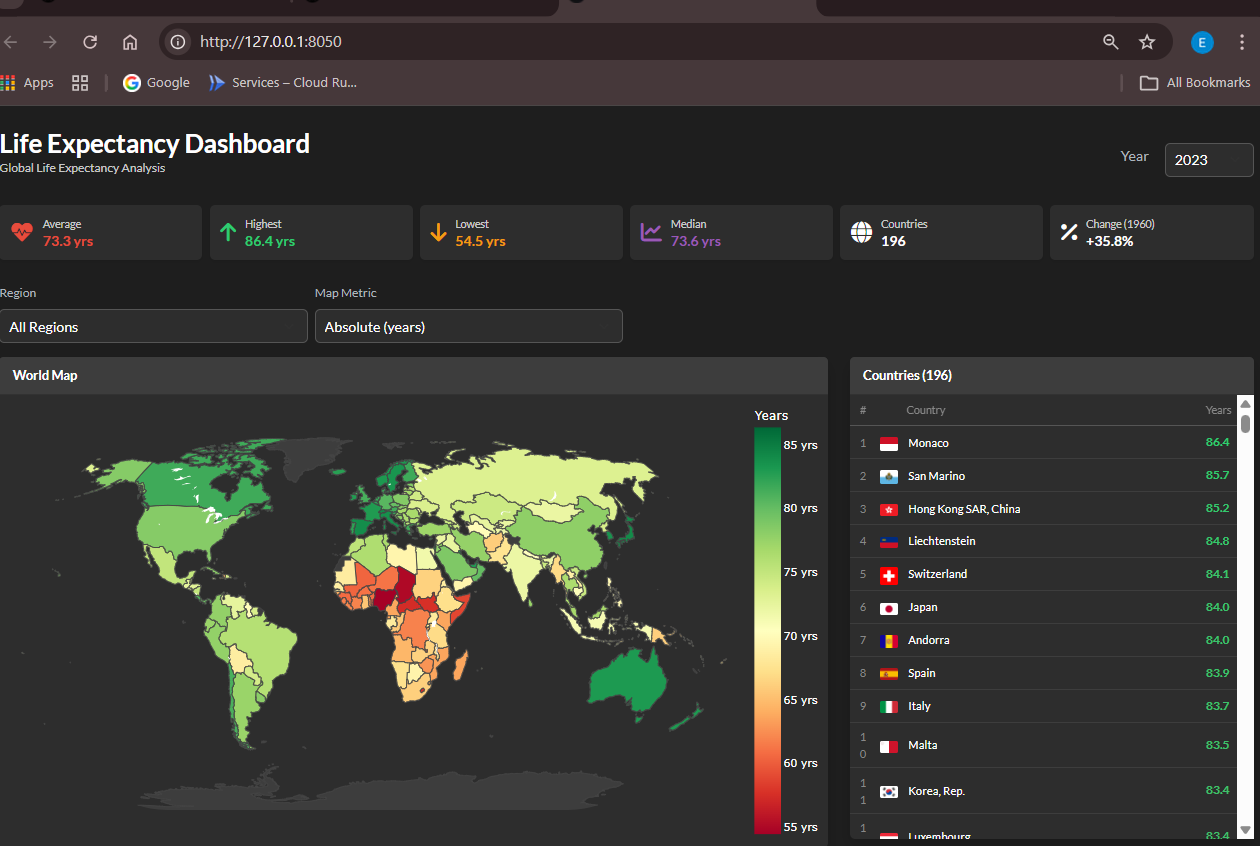
Life Expectancy
Global analysis of life expectancy data across countries. The dashboard visualizes health indicators and demographic trends. Interactive Dash application with color selector feature.
View App
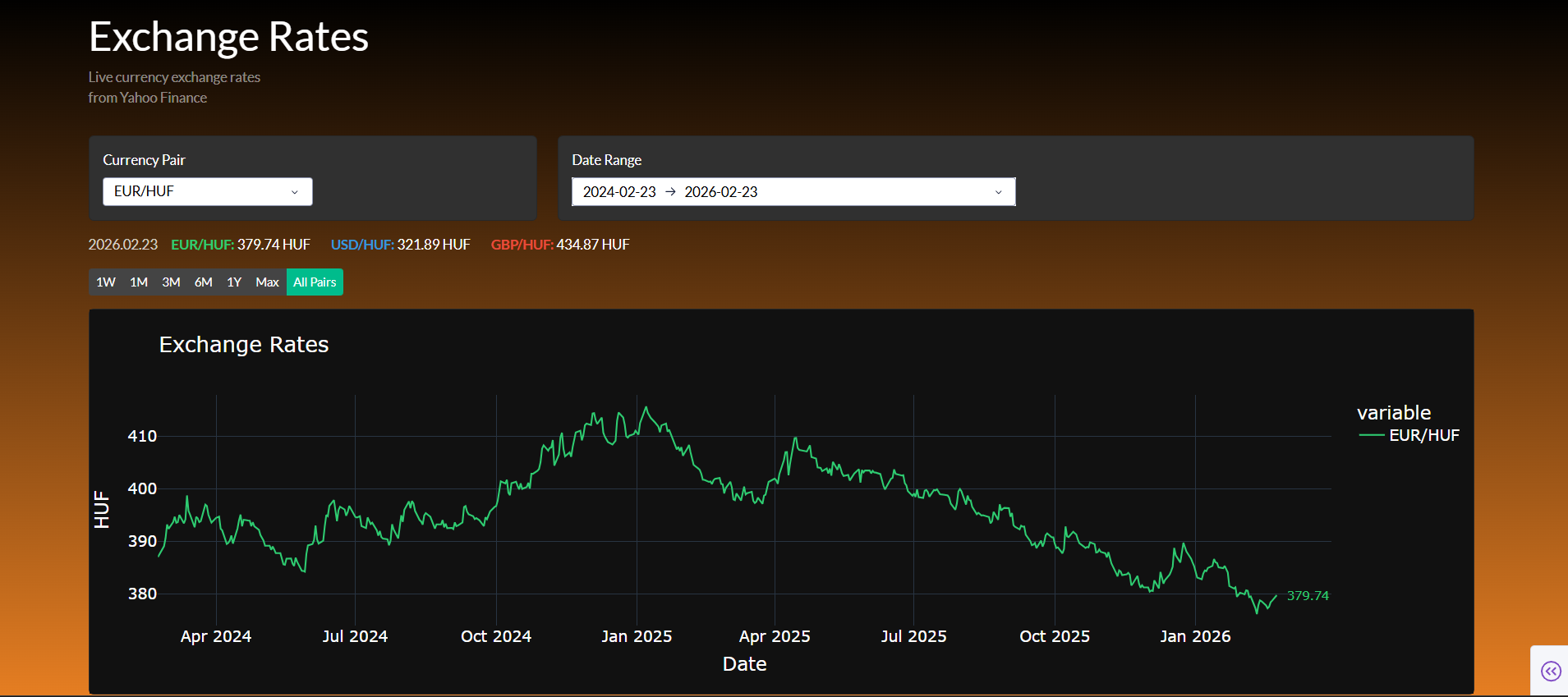
Exchange Rates
Live currency exchange rate dashboard with data from Yahoo Finance. The application displays EUR/HUF, USD/HUF, and GBP/HUF rates with interactive time range selection. Built with Plotly Dash.
View Image
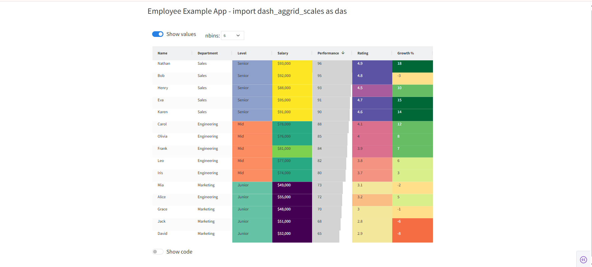
Dash AG Grid Colorscale 1
Interactive data table built with Dash AG Grid featuring custom colorscale formatting. The grid visualizes data with conditional color styling. Built with Plotly Dash.
View Image
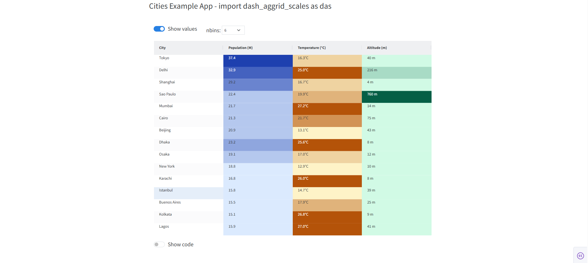
Dash AG Grid Colorscale 2
Interactive data table built with Dash AG Grid featuring a second colorscale variant. Advanced grid formatting with dynamic color rules. Built with Plotly Dash.
View Images
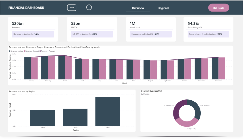
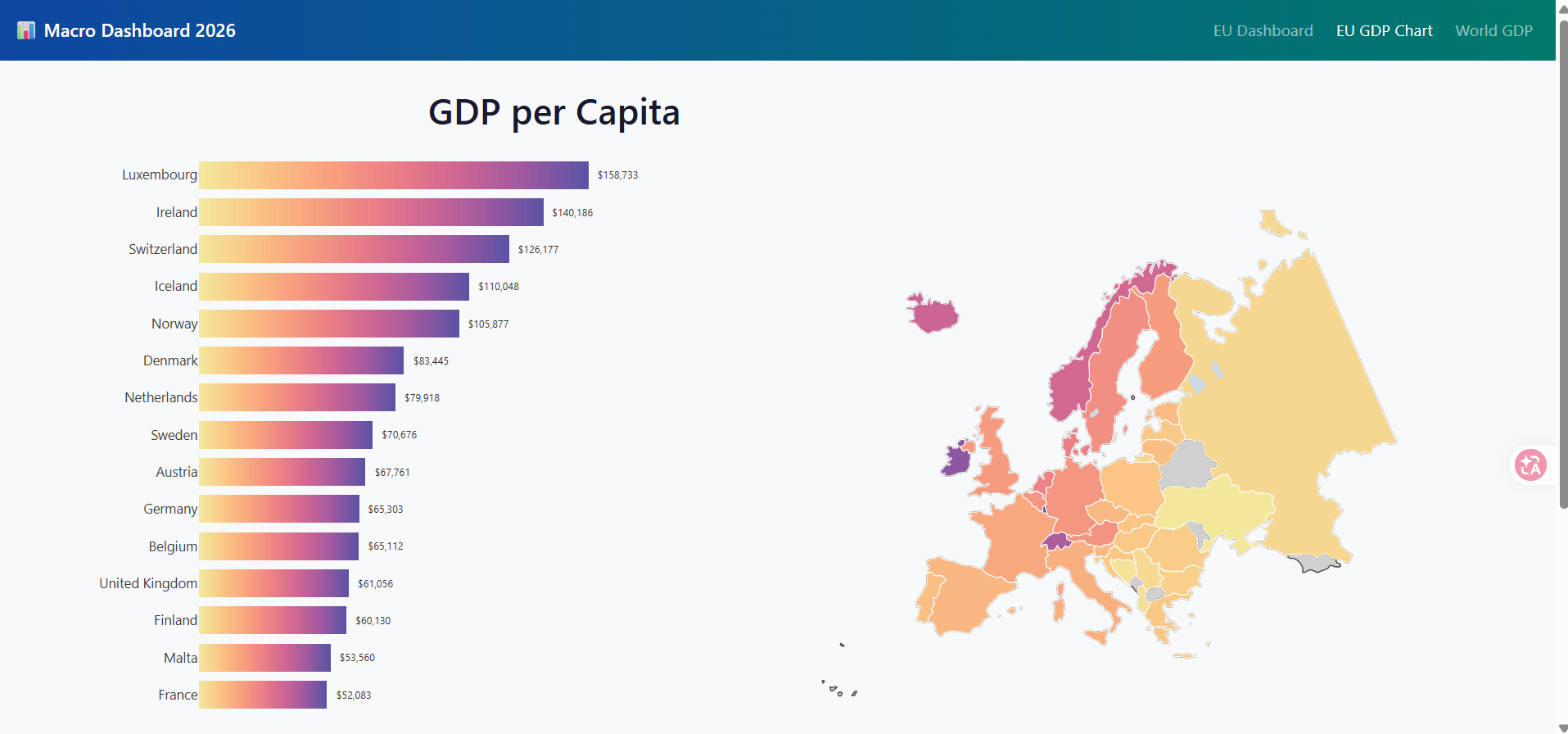
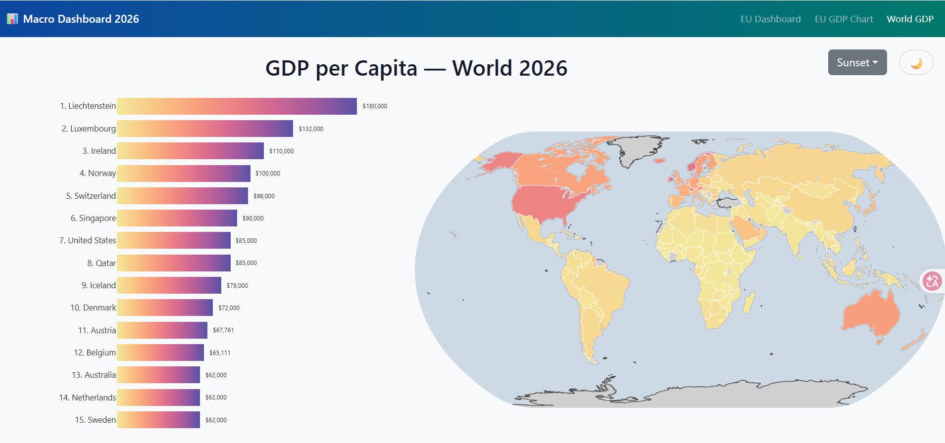
IMF Data
Analysis of International Monetary Fund economic data. Interactive Plotly Dash dashboard visualizing global financial indicators across multiple views.